Interactive Historic Maps of SFO from 1930 to 2021
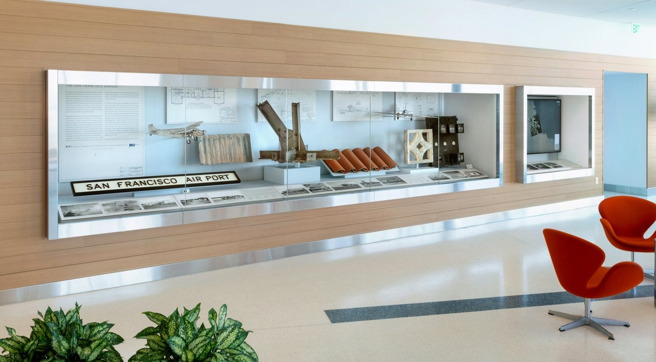
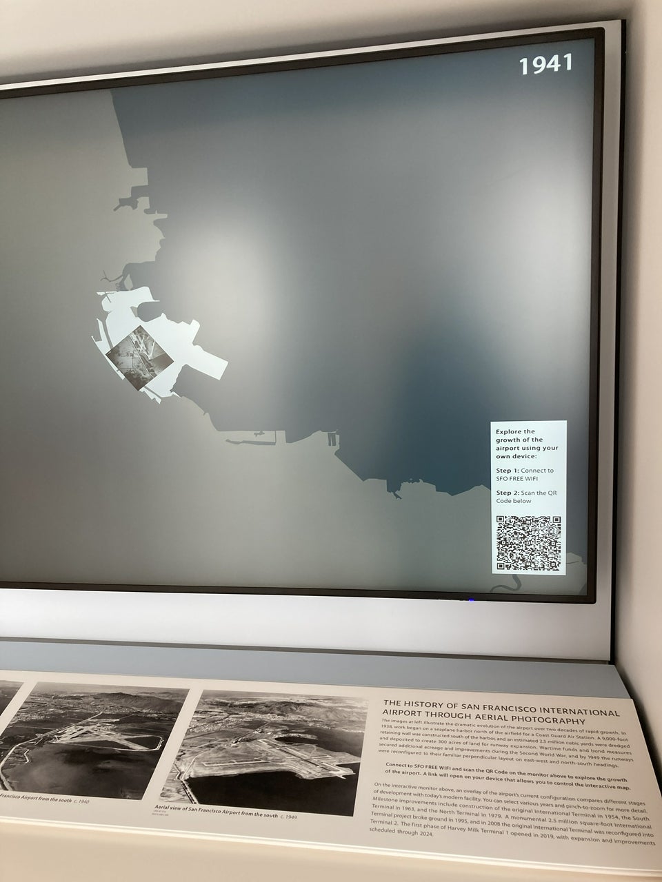
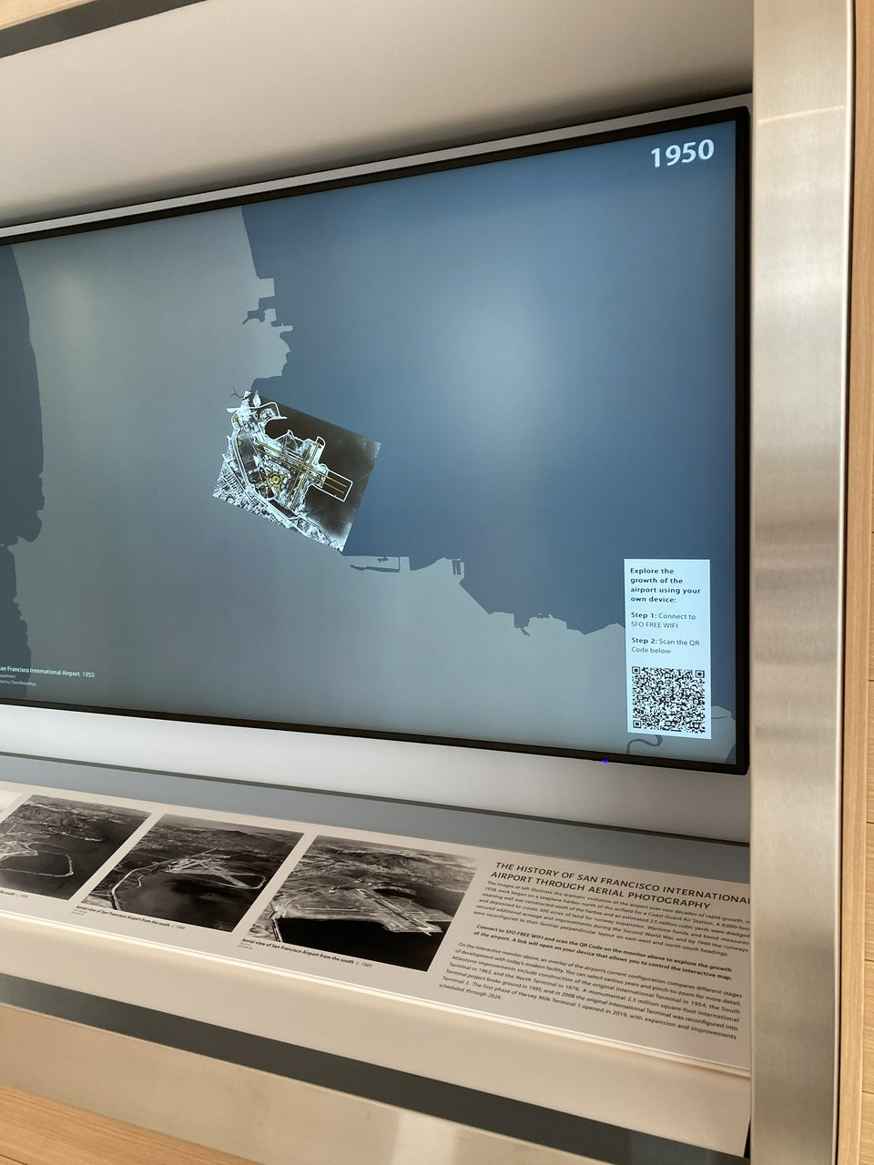
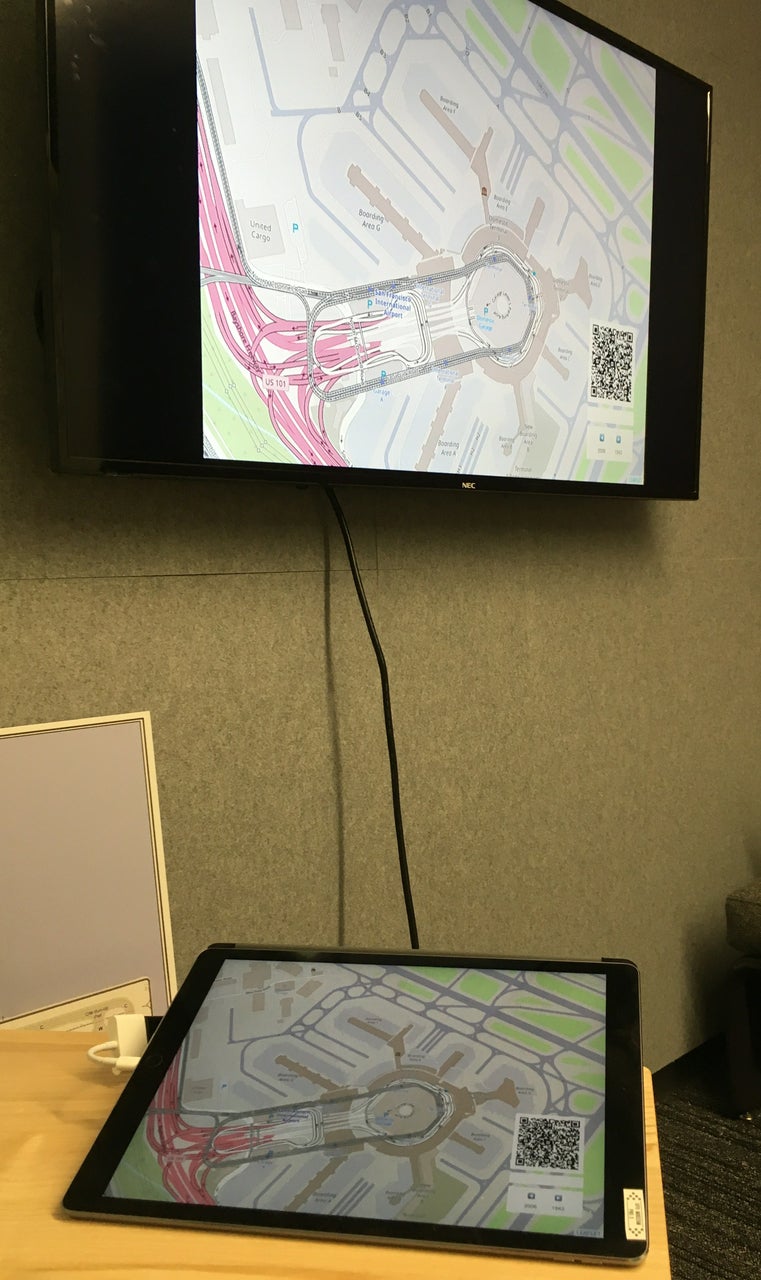
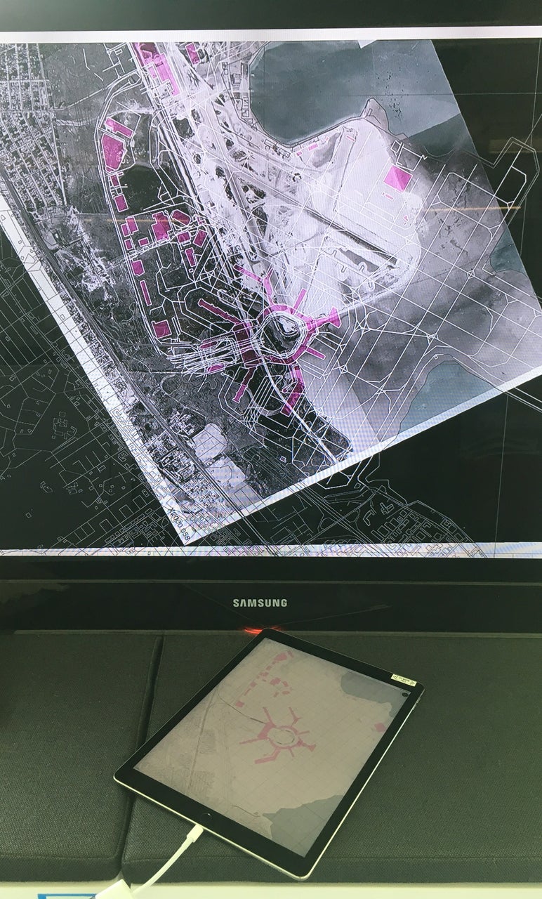
The Mills Field and the San Francisco Airport exhibition in the SkyTerrace observation deck in Terminal 2 includes an interactive map installation that allows visitors to view the history of SFO by browsing over three dozen aerial maps from 1930 to 2021. Originally designed as a touch-based interactive application to work entirely offline, it was updated in 2020 to allow visitors to control the map using their personal mobile devices. The installation displays a QR code that a visitor can scan which will launch a “controller” application that relays instructions from their mobile device to the application running in the SkyTerrace. After 5 minutes a new QR code will be displayed allowing another visitor to browse the map collection.
[image]
Mills Field and the San Francisco Airport, SkyTerrace, Terminal 2, San Francisco International Airport
All of this builds on work the Museum has been doing, since 2018, to make these maps available online on the Mills Field website. These maps reflect the growth and changes at SFO over the years and decades, and you can see them online at millsfield.sfomuseum.org.
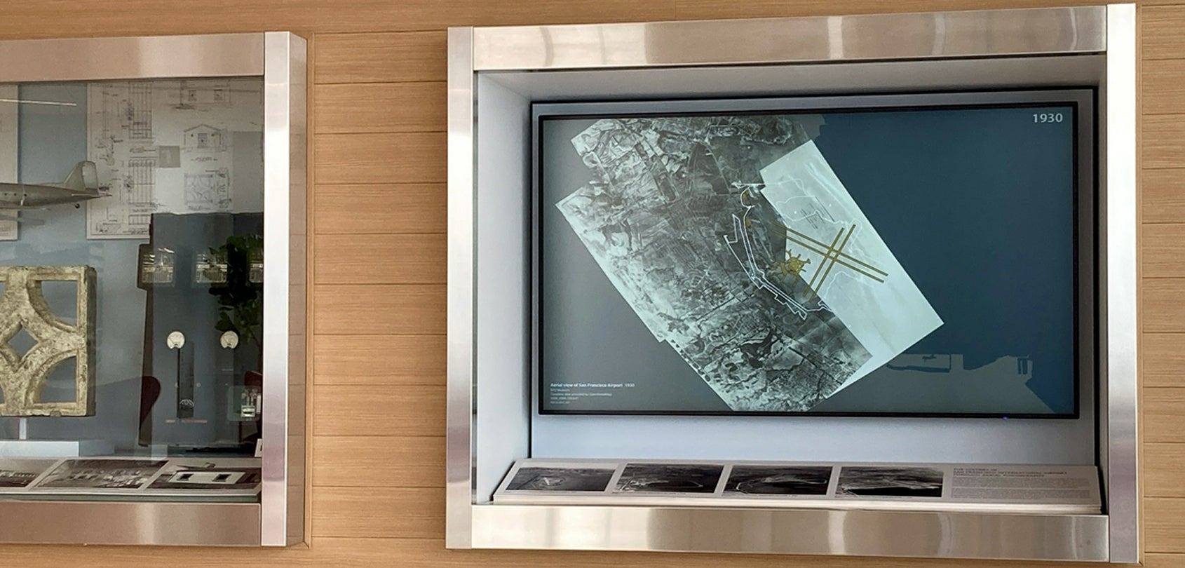
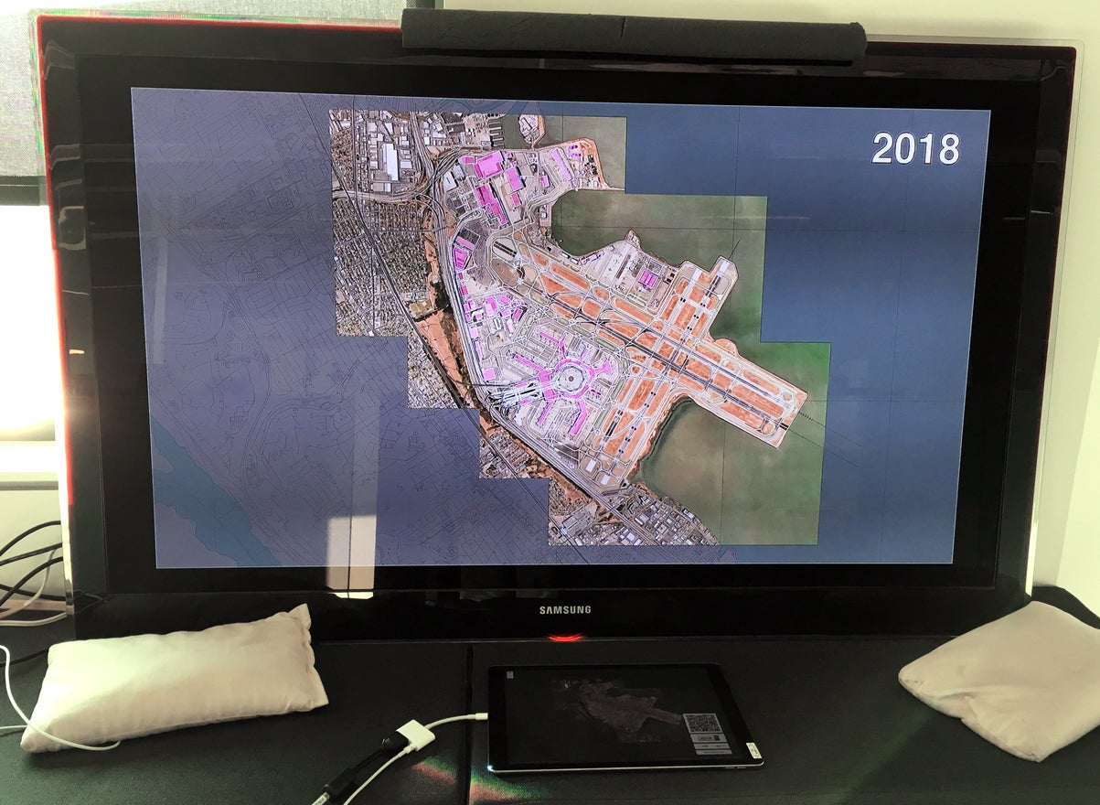
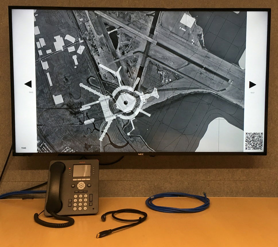
[images]
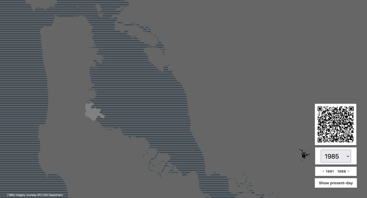
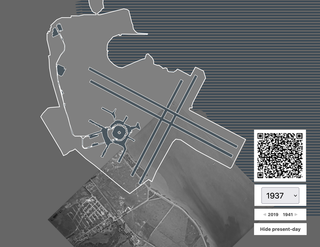
Views of the interactive monitor in the Mills Field and the San Francisco Airport exhibition featuring specific years
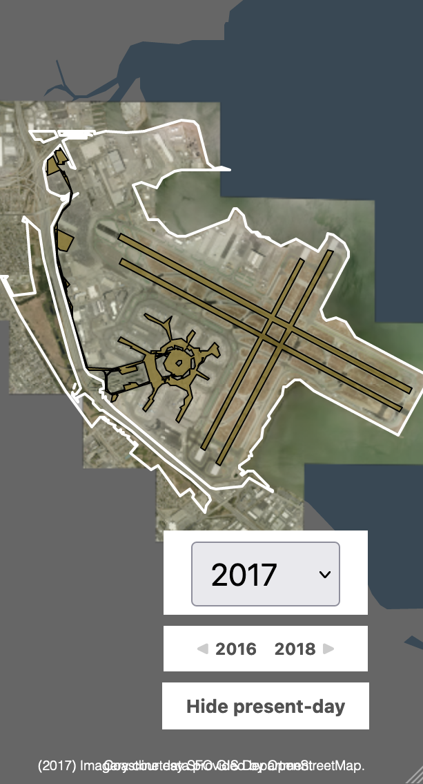
There are maps available from 1930 to 2021 drawing on the Museum’s own collection, the Special Collections Library at the University of California, Santa Barbara, and the Airport’s GIS department. Our goal is to have aerial map imagery for every year since the Airport’s inception. We haven’t quite gotten there yet but there is at least one map for every decade since the Airport opened (and year-over-year maps since 2012). The interactive map allows visitors to change the viewport to see the Airport relative to the greater Bay Area and to hide or show its present-day footprint to better understand the scale and velocity of changes that have been made to the campus.
Every part of the SFO terminal complex, with the exception of the pre-security common area in Terminal 2, has changed since 1954. In 1997 there were cars driving through what is now the International Terminal.
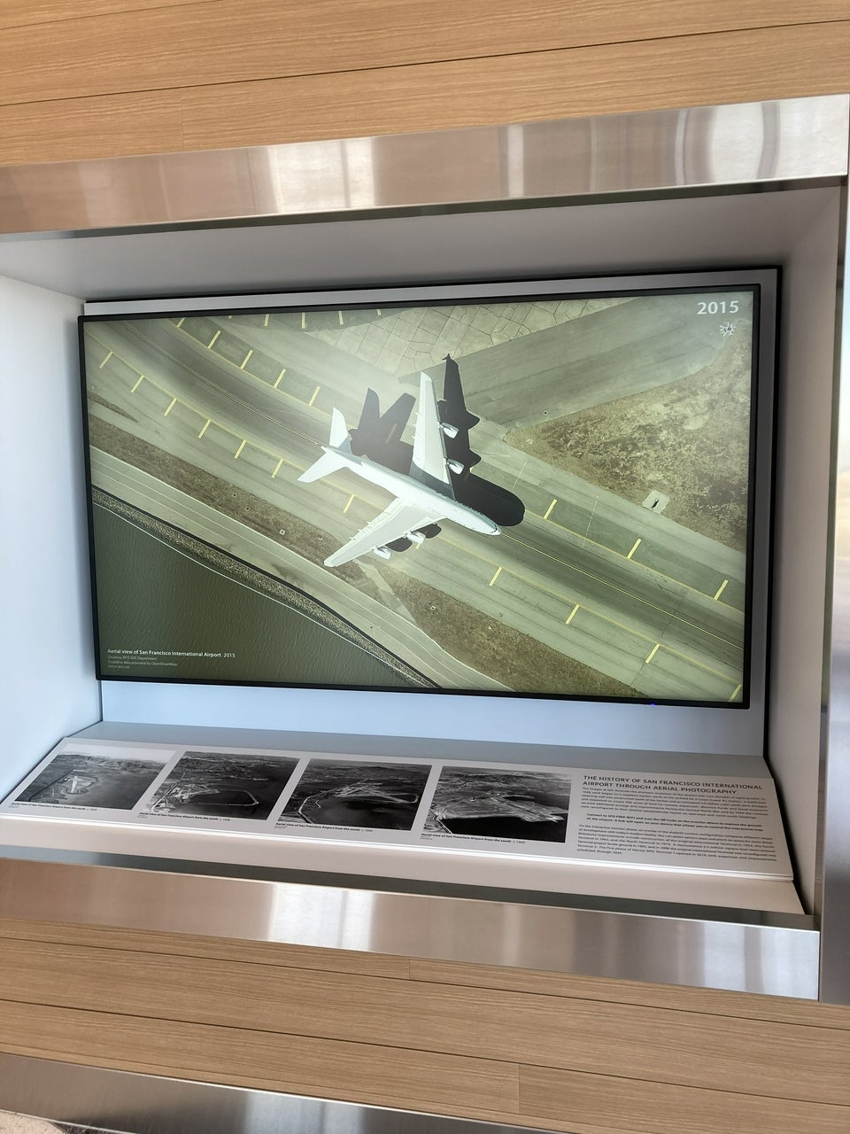

[images]
Views of the interactive monitor in the Mills Field and the San Francisco Airport exhibition featuring planes as they taxi on the runways
The more recent maps, from 2015 onwards, are so detailed that you can get up close to individual planes as they taxi out to the runways.
[images left to right]
First version of the SkyTerrace interactive map; early prototype with integration of QR code; iPad and monitor display final interface (2 views)
Above is an example of what the first version of the SkyTerrace interactive looked like. As mentioned the installation was originally designed as a touch-based interactive using an iPad attached to an external monitor. Under the hood it’s a simple web application wrapped in a native iOS application. In a Mills Field blog post I wrote about making some of that work available as open-source software I said:
Our goal is to treat this as a fast, cheap, and reusable template for building interactive installations. I am fond of telling people that we have developed a system for interactive displays with minimal hardware and stable costs, that work both online and offline, and that we can deploy to any four-by-four foot space at the Airport. The only question should be: What do we want the next interactive to do?
We haven’t yet made any of the tools that allow the map to be controlled from a visitor’s mobile device available as open-source software but we hope to soon.
The early iterations of the application show various ideas for design elements. For instance, in the early versions, the QR code linked to the same map on the Mills Field website allowing a visitor to share a link to the map they were browsing in the SkyTerrace.
In the last two images above you can see that the display on the iPad is simply being mirrored to the external display. The decision to prevent this from happening, to have a single application with multiple screens each showing different content, is one reason we would eventually settle on developing a native iOS application that wraps a simple web application.
The first versions of the application also used a very detailed, but ultimately distracting, cartography to depict the present-day Airport and surrounding Bay Area.
[images]
Examples of early cartographic elements
Once the decision was made to refactor the touch-based application into something that could be controlled remotely, I also took the opportunity to revisit the cartographic elements that frame the historical maps. To start, the detailed road networks of the San Francisco Bay Area were de-emphasized in favour of the Bay itself.
A similar approach was taken with the Airport campus itself focusing only on those features that passengers are likely to interact with when flying in and out of SFO. We are grateful for the help and assistance that the Airport’s GIS department provided in making these data available, enabling us to develop systems that will track changes to the Airport’s physical footprint over time.
The switch to a network-enabled application with multiple users necessitated a lot of juggling of different states and ensuring relevant feedback for different scenarios.
[images]
Example of the design and interaction elements starting to settle into what’s on display today; screenshot of the mobile “controller” application
The mobile “controller” application is designed to mirror, as much as possible, the interactive itself. Here you can see that stripes used to represent the San Francisco Bay have been replaced by a solid colour and some outstanding layout issues for credit lines displayed on a mobile device.
[image]
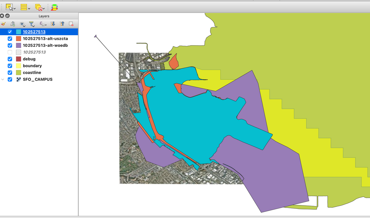
Example of geometry of San Francisco Bay coastline via OpenStreetMap
The geometry for the San Francisco Bay coastline was sourced from the OpenStreetMap project and required a little extra GIS processing to line up with the Airport’s own geometry for the campus.
[image]
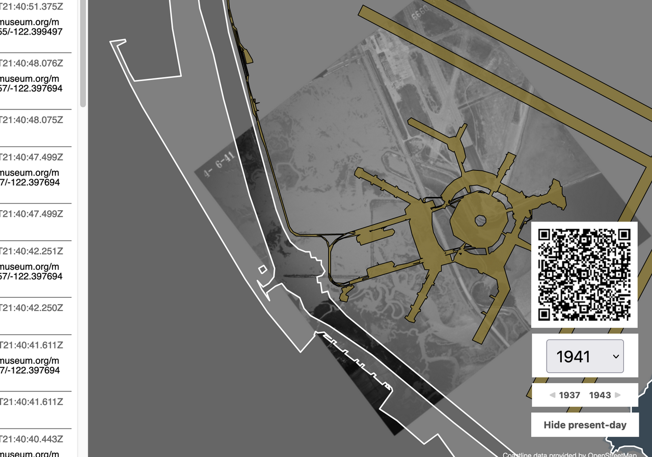
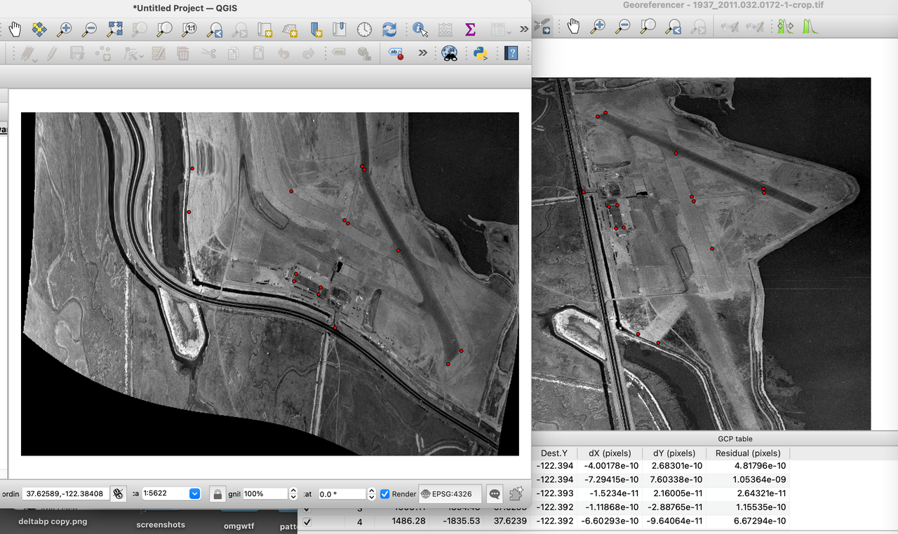
Examples of aerial maps
Many of the aerial maps needed to be “georectified” to match the map projection used by web-based applications. This is done by making a table of latitude and longitude coordinates in a target projection that correspond with x and y pixel coordinates in a source image. These are the red dots in the images above and below. Once that mapping has been done it can be used to warp the source image. It doesn’t always work especially for images taken at an angle, as you can see in the examples.

[images left to right]
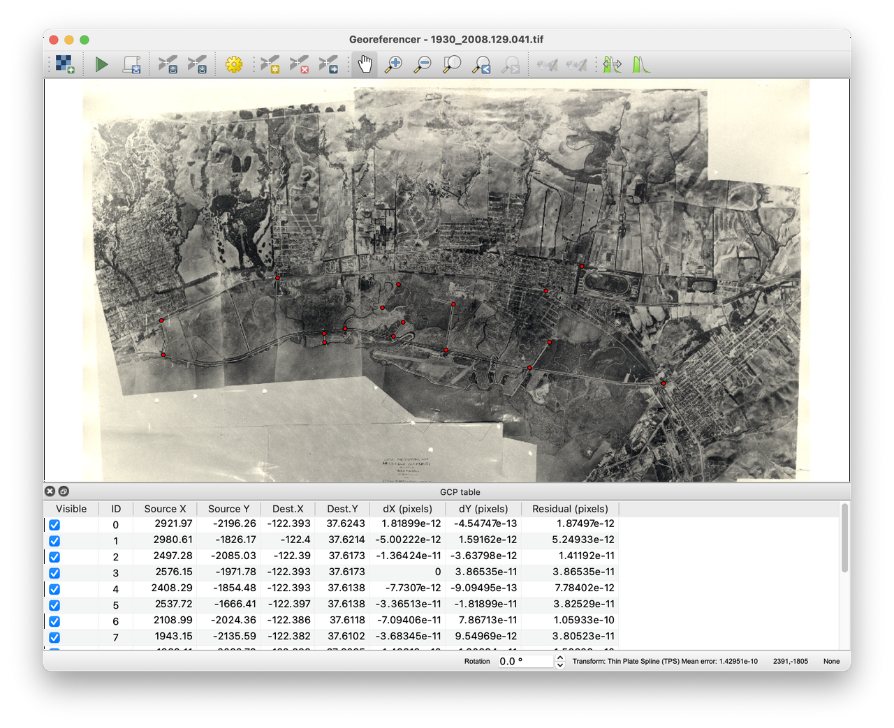
1930 aerial image; "georectified' image
In the example above of the aerial imagery from 1930 the North-South axis of the Airport is displayed right to left rather than top to bottom. Because the photographs were taken from an airplane flying directly overhead the warping operation is much more successful. The image to the right is what it looks like after being warped with aerial imagery from 2020 overlaid. This map is now on view in the SkyTerrace.
The installation will be continuously updated as new maps become available. The SkyTerrace observation deck in Terminal 2 is open to the general public Friday through Monday from 10AM to 6PM, and we hope that you are able to stop by for a visit!
As mentioned all of the work for the SkyTerrace interactive builds on work the Museum has been doing around historical maps since 2018. If you’d like to read more, these blog posts (sometimes highly technical) describe some of that work:
• Map updates, 2019 - 2020, January 2020
• More recent old maps (and the shapes in the details), November 2019
• More old maps and more-better architectures, October 2018
• Old maps (and old map tiles) at SFO Museum, August 2018
Aaron Cope
Senior Digital Specialist
SFO Museum